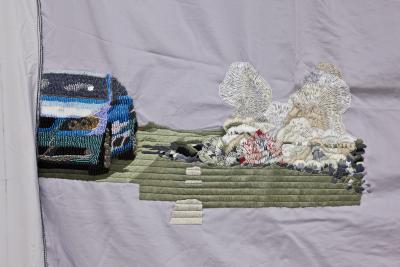
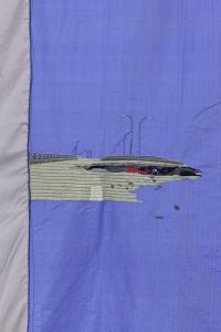
Loch II (kleines Mädchen),
Oui,
Rödig,
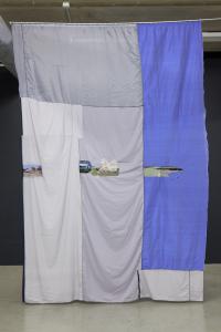
Vorhang (sinkhole),
Umzug,
Vorhang (Nördlicher Raum),
Isa Melsheimer
1.9.2008 AND 8.11.2008
(Isa Melsheimer in conversation with Katrin Wittneven from Novem-ber 2008, as well as an extract from Wittneven’s presentation on Melsheimer’s work from September 2008)
Architecture is a central theme in your work. What are the implications with regards to planning and how do you approach exhibition spaces?
There are familiar spaces, such as gallery spaces and others, which you only know from photos. Usually, I go there first, walk around, look at maps and take in the surroundings: where is it? What kind of place is it? What is its history and how am I connected with it ? I had already exhibited at the Municipal Galerie Nordhorn in a group show three or four years ago. It was back then that this particular space, a piece of work by Steven Craig referring to Mies van der Rohe, interested me.
What did you remember?
A space within a space. I believe that Stephen Craig’s intervention had originally been much finer, purer somehow. Over the years, more and more new fixtures, offices and flooring were added so that, today, you hardly experience the space as a piece of work. I was interested in making the work visible again, extracting the ‘borrowings’ from Mies van der Rohe, explicitly the Barcelona Pavilion, and developing them further.
In Nordhorn, Isa Melsheimer came across a pavilion that had been designed as sculptural architecture by the Irish artist Stephen Craig in 1999. A versatile all-purpose space that not only in its multi-functionality, recalls the work of Ludwig Mies van der Rohe. A contemporary response to Mies’s credo “less is more”.
Looking at the basic architectural elements − pillar, wall, roof − the steel-glass-construction of Berlin’s New National Gallery (completed in 1968), as well as Mies van der Rohe’s first architectural milestone: the Barcelona Pavilion of 1929, cross one’s mind. It was with this temporary building that Mies, for the first time, began to achieve the great sense of clarity and simplicity that he strove for. The Pavilion only existed for a few months and was not re-constructed until the eighties. The crucial innovations were the “open plan” and the “flowing space”. The reinforced concrete roof of the Barcelona Pavilion rests on filigree stanchions with wall-elements and panes of glass stretching from floor to ceiling. Flooring, roof and wall-surface do not enclose the space but rather suggest peripheries. The result is a clear structure which also allows for various spatial combinations. Mies himself was well aware of the revolutionary power of this innovation: “One night, I was working late (on the Pavilion) when I made a sketch of a freestanding wall and was absolutely shocked. I knew that I had found a new principle”.
Isa Melsheimer absorbs Craig’s directions and by transforming elements of the Barcelona Pavilion into the exhibition space and translating them into her own artistic vocabulary, develops them even further. She creates a very minimalist interior: a curtain, a carpet and a pillar from chrome-plated stainless steel. The crosswise pillar − also a direct Mies quote − is rather reduced. Less is impossible, is it still meant to bear weight. It extends the raster of the exhibition’s architecture and, at the same time, in its isolation and with its minimalist reflecting surface, gains a sculptural quality. In contrast to the Barcelona Pavil-ion with its black carpet and red curtain fabric, the artist restricts herself to stone-like shades of green, brown and grey.
You take Craig’s space back to its original condition, dispense with partition walls and fixtures and, instead, combine more diverse materials: stone, glass, fabric, onyx.
I am fascinated by the story of a block of onyx which Mies came across by chance, being the starting point of a building as legendary as the Barcelona Pavilion. The dimensions of this stone were the starting point and the fixed point in the planning of the Pavilion. I’d had boards of travertine, which I had accidentally come across, sitting in my studio for some time. They seemed to be perfect for Nordhorn.
In Isa Melsheimer’s replica of the Barcelona Pavilion, the original atrium becomes a landscape of broken glass. A lucid construct, consisting of countless splinters of glass which, in its glittering, fragile beauty, appears to be vulnerable and thereby dangerous, at the same time. The plates of broken glass, shimmering in green shades, trigger associations with Caspar David Friedrich’s “Sea of Ice”, as well as with models of futuristic mega-cities. You think of a wave, frozen in its movement, but also of abstract translations of landscapes, seen on weather charts after the news. In the exhibition, they mark an area of 660cm by 100cm and thus, have exactly the dimension of the atrium of the Barcelona Pavilion. Its panes were made from white glass and so allowed the image of a secret garden to flourish.
Did you have a clear picture of the exhibition in mind, beforehand?
I clarify a lot of things with the help of a model and I usually have quite a clear idea before I start. In Nordhorn, a few things were -already predetermined, as my arrangement was based on the Barcelona Pavilion. The 120 onyx-vases were arranged on the surface of the original onyx-wall and the dimensions of the glasswork were geared to the dimensions of the atrium of the Barcelona Pavilion.
Onyx is quite a classical material. At the same time, you caricature the traditional stone by using onyx-vases, known from tourist-traps.
This also has to be read as an ironic comment, of course. In the exhibition, you can hear extracts from an interview with Mies from 1968 over headphones. In this conversation, he explains, how, originally, the shipping company was to receive the block of onyx, in order to make large vases for the dining-hall out of it. Mies chipped off a thin slice to show how beautiful the stone was and thus, even-tually got it for the Pavilion. My work plays with the ugliness of such vases, which look rather like urns. Yet, strangely, they look quite acceptable en masse.
It was one of Mies van der Rohe’s principles to use materials as they approach you, in a way, listen to them and recognize the structural qualities of steel and stone, and in this way, to embrace them and subject them to the desired shape.
There is not much left of this liberation, of the innovations brought about by architectural modernity. Most things that are constructed today are, again, closer to the onyx-vase than to the onyx-wall. Embroidery on pillows shows examples of buildings that mainly place emphasis on their decorated facades. One example is a red brick building at Potsdamer Platz which is only a few years old and appears to be very solid but has already started to lose bricks. Only then did it become clear to me that they are not actually bricks but clinker. Strictly speaking, this means two steps back: Modernity introduced the open plan. Today, we are back at small windows in brick-walls. And they are not even real. That is simply decoration, kitsch, a tourist-trap − just like the onyx-vases.
Mies van der Rohe wanted the big hall inside the New National Gallery to be used as a stage. Isa Melsheimer’s installations and sculptures, too, repeatedly evoke associations with stages. In both, art becomes the protagonist; as does the viewer who walks around in it, picks up the thread and follows.
Is there ever a moment when you consider a space to be completed?
Yes, I think so. Often, it is very full to start with and then becomes increasingly empty. I work on details in a very precise way but I eventually get to a point where I say, okay, let’s leave it as it is. There is no such thing as the perfect space. I believe there is always more than just one possibility. Is that what you mean?
I meant it in an even more concrete way: Mies also had a theoretical background for his way of working. He once said: “I felt that it had to be possible to harmonize old and new powers within our civilization. Each of my buildings was a demonstration of this thought and a further step in the process of my own search for clarity”.
In my eyes, art can only clarify what is there already. Not only in the sense of harmony or beauty, but in the true sense of clarity. That is a good word for it.
Fremdenzimmer
B9,
Fremdenzimmer,
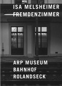
Fremdenzimmer, catalogue, text by Klaus Gallwitz, Jutta Mattern, Marcel Raabe and Pelin Tan, biography and list of publications, 56 pages, 16 colored illustrations, Richter Verlag, Düsseldorf, ed. Arp Museum Bahnhof Rolandseck, 2008


